
Case Study
Coinlinx Website Design
Role: Taz Hussain, UX Designer
Platform: Half Hour Stakeholder Project Presentation: 09/05/17
Timeline: 08/18/17–09/05/17
Tools: Sketch · Invision · Adobe Creative Cloud · Prototyping · Accessibility Tools · HTML (basic) · User Flows · Customer Journeys ·
Team: 3 members UX design team collaboration
Overview
Coinlinx, a FinTech startup led by CEO David, needed a responsive website redesign to better communicate its two core offerings: Bitcoin ATM services and blockchain-based smart contract solutions. The existing site lacked clarity, user engagement, and educational resources for audiences unfamiliar with complex blockchain concepts. The goal was to create a platform that attracted potential clients, educated users on cryptocurrency fundamentals, and showcased Coinlinx’s innovative use cases across industries such as insurance and travel.
Process
Our three-member design team approached the project with a user-centered methodology:
Research & Evaluation: Conducted a heuristic evaluation of the existing site and performed A/B testing against competitor websites to identify usability gaps and opportunities.
User Insights: Findings from testing informed the information architecture and feature prioritization, ensuring the redesign addressed both business goals and user needs.
Design Execution: Developed high-fidelity wireframes in Sketch, focusing on intuitive navigation, clear service presentation, and educational content integration.
Prototyping: Built an MVP prototype in InVision for stakeholder review and iterative feedback.
Solution
The redesigned website featured:
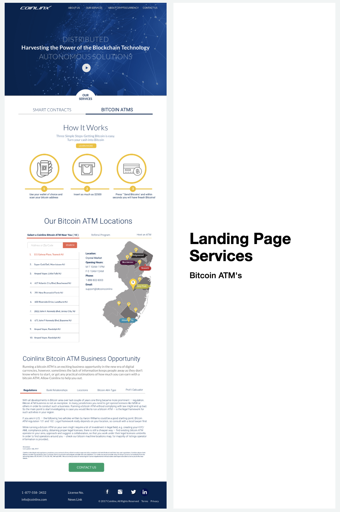
A streamlined client capture form to drive lead generation.
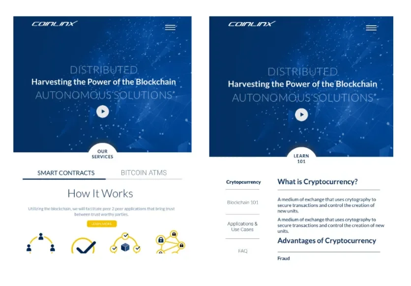
A “Cryptocurrency 101” section offering accessible educational content for users new to blockchain.
Dedicated pages highlighting Coinlinx’s blockchain applications in sectors like insurance and travel.
A responsive design optimized for both desktop and mobile experiences.
Impact
The redesign positioned Coinlinx as a credible and approachable player in the FinTech space. By combining educational resources with clear service offerings, the site improved user engagement and facilitated client acquisition. The MVP provided a strong foundation for future iterations and scalability.
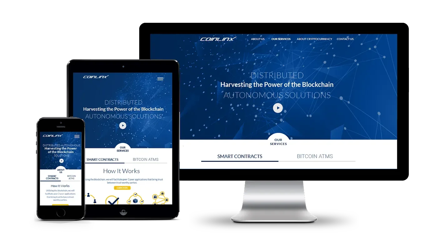

Information Hierarchy - We redesigned the Coinlinx website to guide users through a narrative that begins by defining Coinlinx two business solutions: SmartContracts & Bitcoin ATMs. We then introduce use cases which demonstrate how Coinlinx provides these services. Finally we ask, how might Coinlinx work for the users in order to get people to engage? We ended each page navigation with a Contact CTA to steer users to contact Coinlinx in order to either learn more or get started.
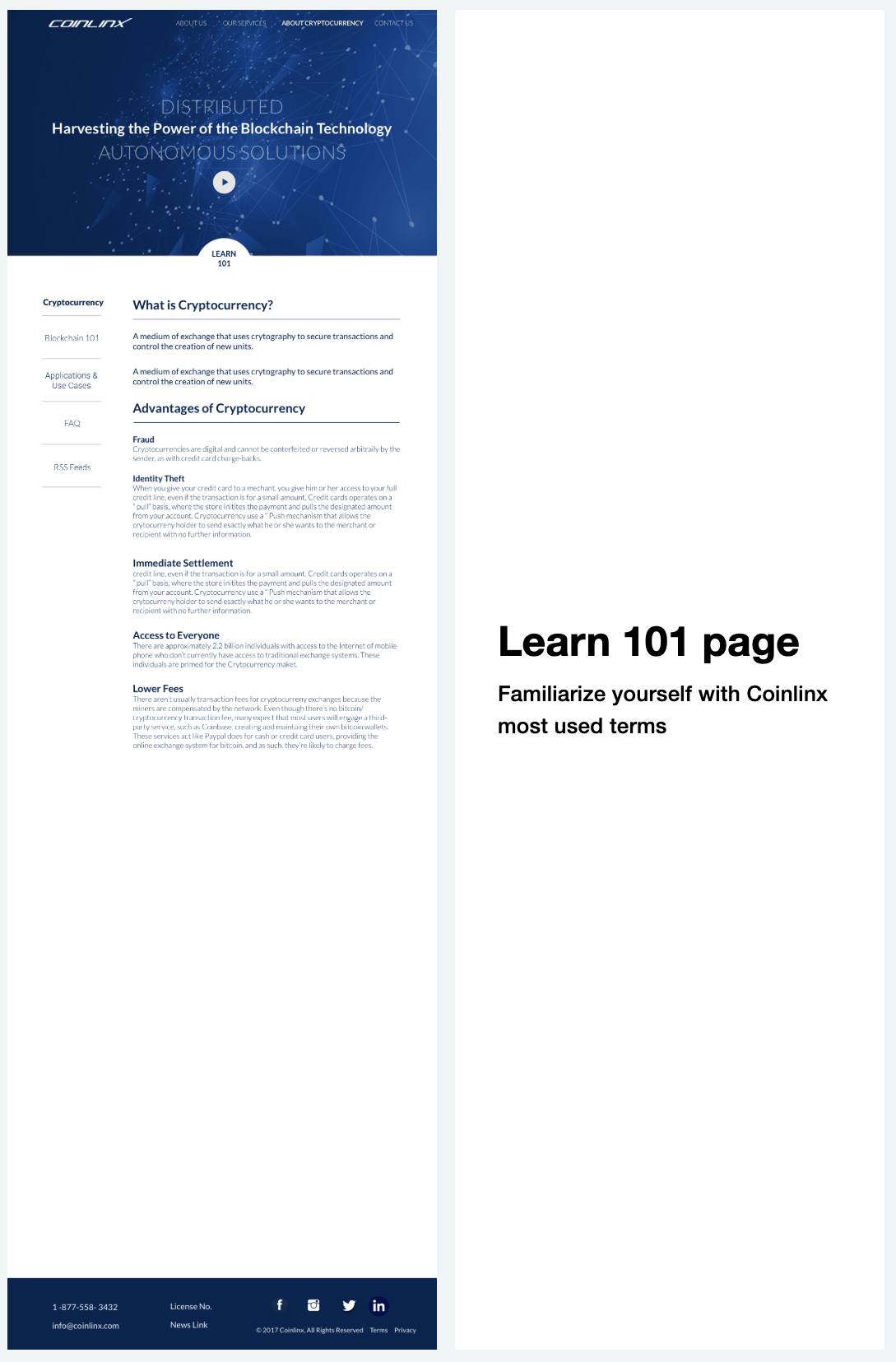
Content Priority & New Features - We communicate the relative importance of the site’s content through graphics, typography, site structure, and user task flows. Additionally we introduced an About Cryptocurrency knowledge section which contains FAQs, infographics, videos, and an RSS feed to source relevant articles.
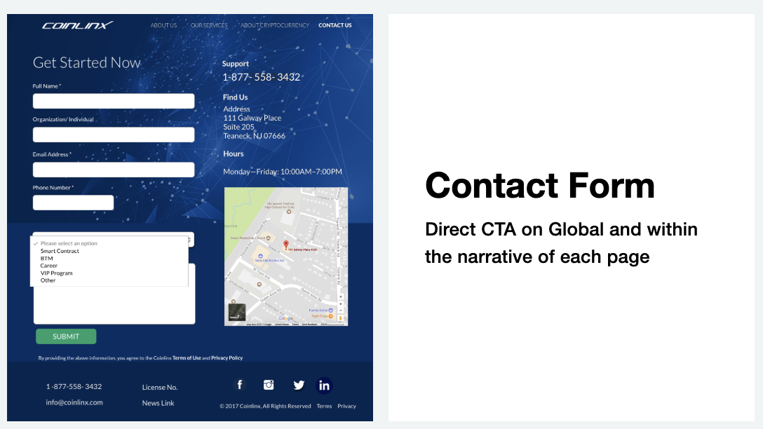
Business Contact/ Intake Form - We ended each page navigation with a Contact CTA to steer users to contact Coinlinx in order to either learn more or get started.
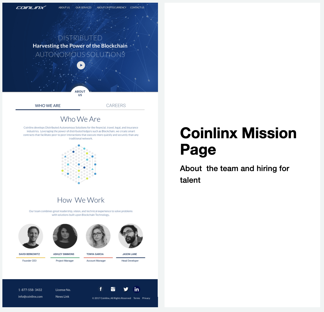
Coinlinx Mission Page
Process & Artifacts
Problem Statement: Coinlinx seeks to introduce informative content that will lead customers to Coinlinx services
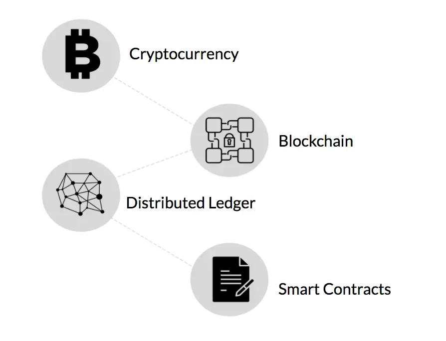
Coinlinx Company Mission: Harvesting the Power of the Blockchain through offering:
Distributed Autonomous Solutions
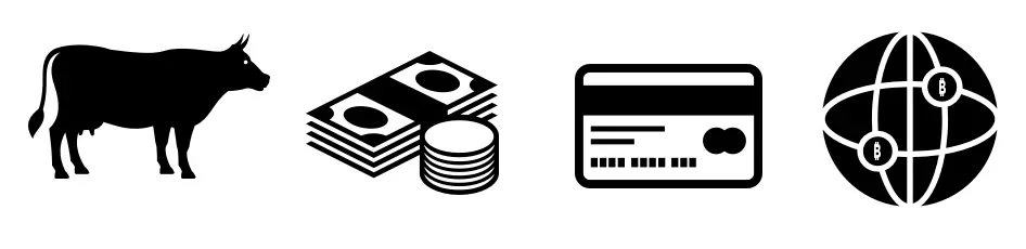
Cryptocurrencies & Bitcoin ATM’s
Blockchain Technologies
Smart Contracts
Understanding and establishing a narrative:
“This is not a revolution, this is an evolution. From barter to currency to credit to digital”
“Bitcoin will do for money, what Email did to the post office”
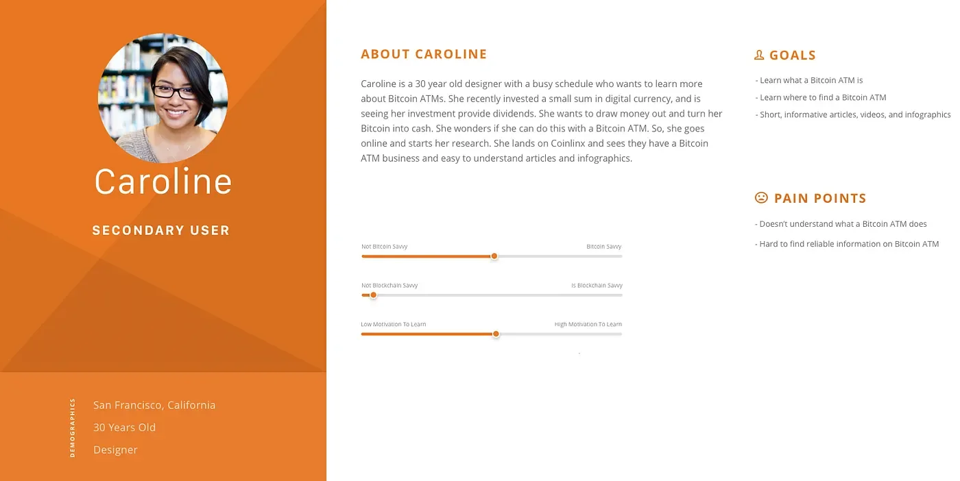
Persona creations:
“I have an idea that could impact the real estate market by using smart contracts”
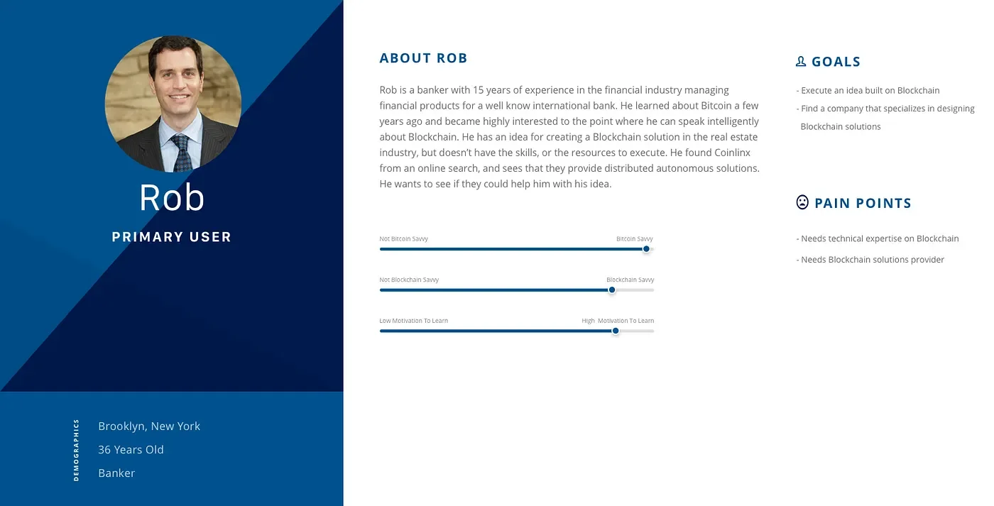
“Can I turn my Bitcoins into cash by using one of these ATM machines?”
Testing
A/B Usability Tests, Agile Sprint Iterative Design and Redesign
Strategy:
Conducted 2 separate A/B user testing on total of 8 users comparing
Current Coinlinx website and 1 competitor site
Current Coinlinx website with our Lo Fi MVP
Goal:
Can the user easily understand what each website’s business provides ?
What are the ways in which that message is conveyed?
Heuristic Evaluation
Take Aways:
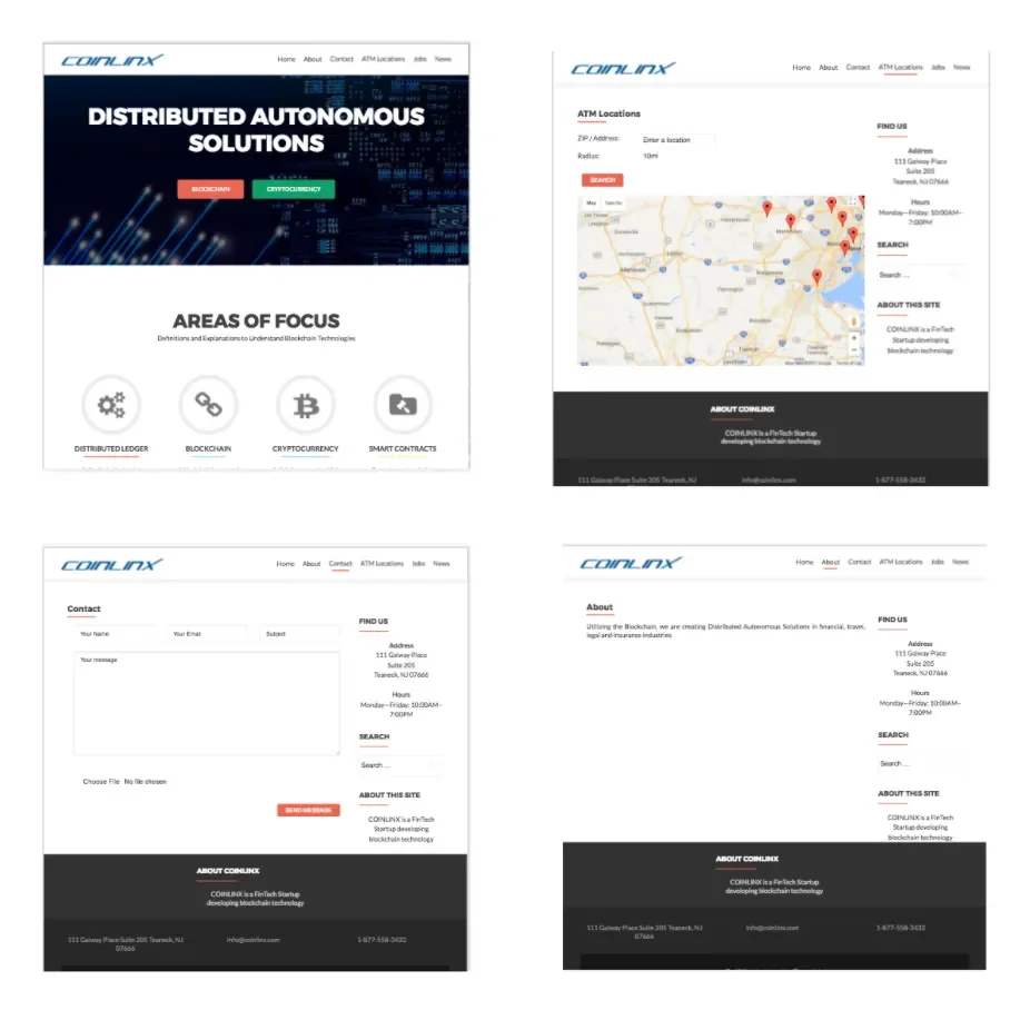
Core business not conveyed clearly: The Background Image looks like an IT Solutions Company. Having ATM in the header looks like it’s a banking company. And “Fintech Startup” sounds like they a financial institution.
Navigation Lacking: The main page does not show any navigation buttons. So it’s hard to tell whether one can scroll down for more information
“ATM Locations” is a confusing taxonnomy: should change to indicate that these are not everyday ATM’s.Currently the industry is struggling for want of a fixed term.
Cryptocurrency and Blockchain Technology is a difficult topic to grasp. Not many reliable subject matter knowledge platforms available as a resource for users.
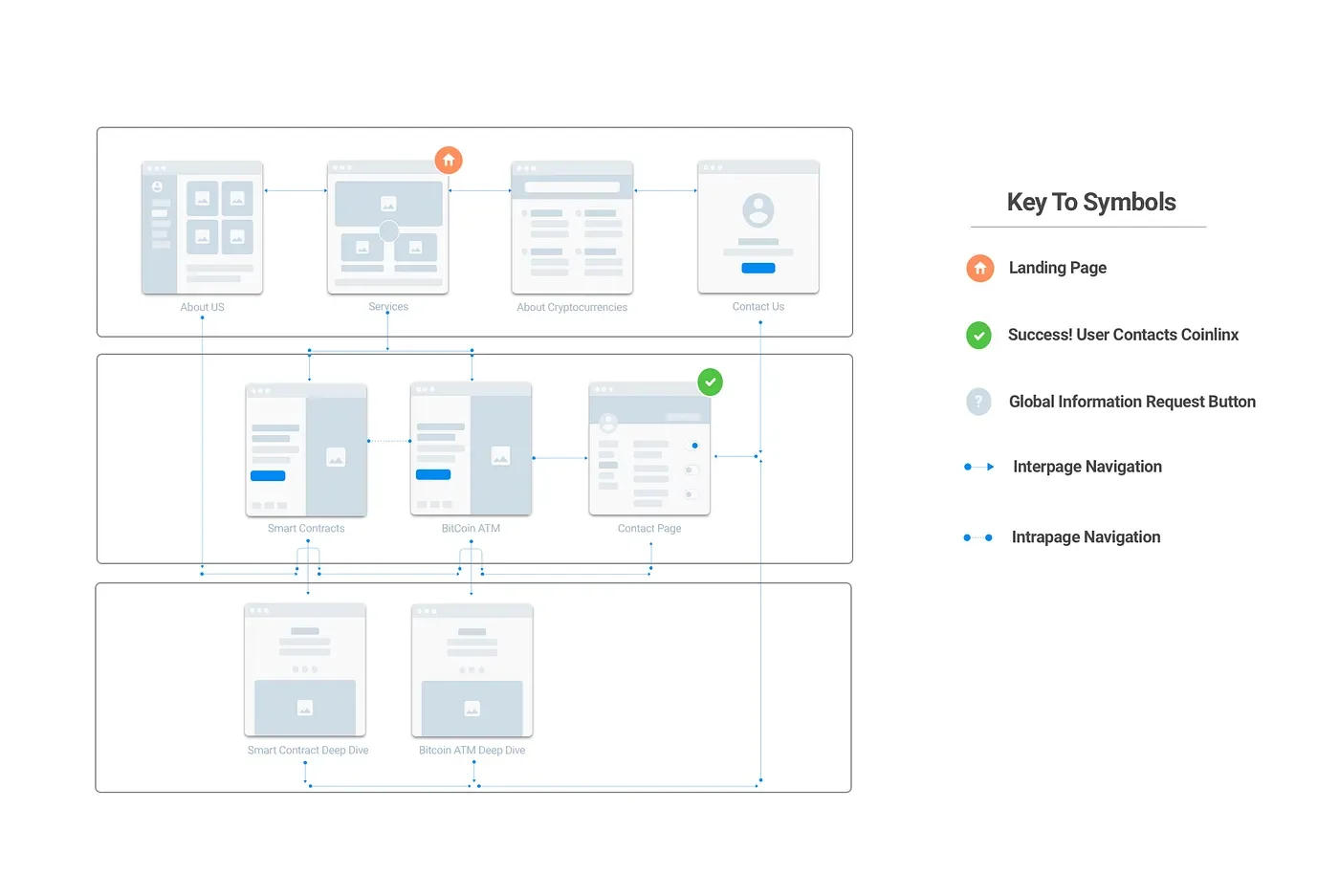
Wireflow redesigned for Coinlinx
Features
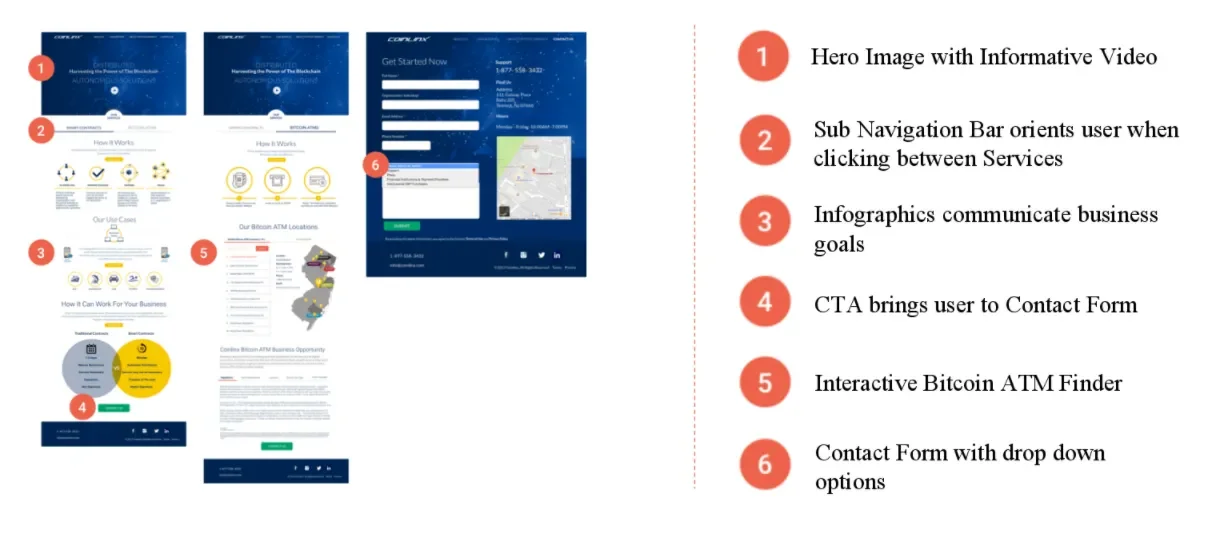
Narrative drives customer to contact Coinlinx:
How it works
Our use cases
How it can work for your business
New learning platform:
Articles and videos on Cryptocurrency & Blockchain
Applications and use cases
FAQ
RSS Feed
Hi Fi desktop annotations landing page and contact form
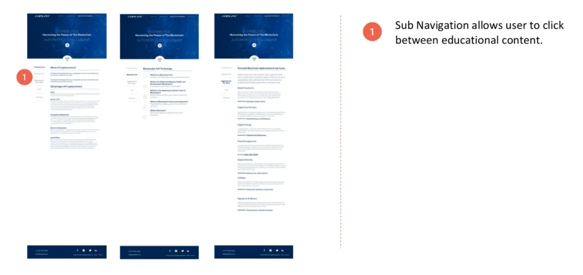
Hi Fi desktop annotations screens: about cryptocurrency and blockchain technology information
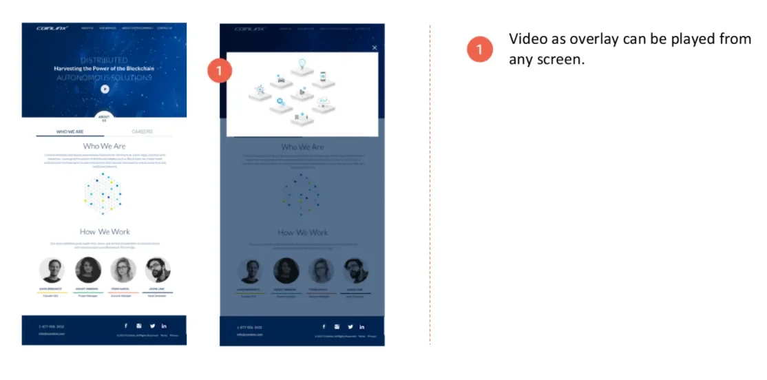
Hi Fi desktop annotations: about us and concept of video display
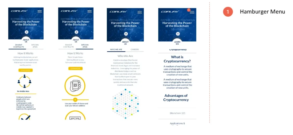
Hi Fi annotations mobile screen and hamburger menu
Hi Fi Tablet Screen
Next Steps:
Scalable scope for growth:
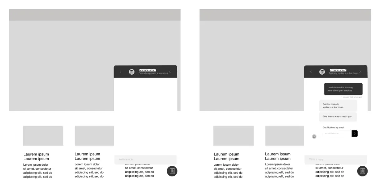
Incorporate fixed navigation sticky for chat Support
Compile RSS Feed based on reliable resources
Lo Fi Sketch mock up of sticky screen